Data Visualization Projects
-

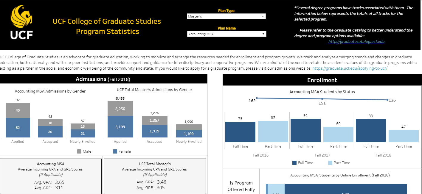
UCF College of Graduate Studies Statistics
This dashboard was created using Tableau. The dashboard is still featured publicly on UCF’s website
-

Boston Crime Statistics Dashboard
This dashboard was created in Tableau and utilizes 2015-2019 crime data from the Boston area
-

Waterfall Chart Example
This waterfall chart was created in Tableau and visualizes delays in the development cycle of a data project
-

Population Triangle Chart Example
This population triangle chart was created in Tableau and uses US population data
-

Diverging Stack Bar Chart Example
This diverging stack bar chart was created in Tableau and features survey data regarding confidence in women’s role in government